My Trip
UX Design mobile app concept
The Problem
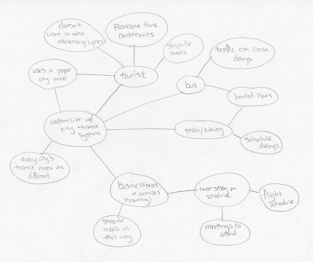
People who are visiting cities, often are confused by the city’s mass transit systems. Each mass transit system, from city to city, is different. Even the routes/maps seem like they need to be translated differently. A lot of time is wasted reading maps, and trying to figure out bus or subway routes.
Research
I gathered information from contextual inquiries, mind-mapping, and my own experience as a traveler. From this information, I prioritized issues which I find to be an issue for a person traveling in a new city.

Ideation Sketches

Personas
Name: Katie
Age: 37
Location: Sedona, Arizona
Personality: Busy body, adventurer,
active, appreciates efficiency.
Bio: Katie is an artist & a mother of two. Although she lives in a smaller city, she loves to travel to other cities and explore, with her whole family. She is always on the go and busy. Katie’s ideal vacation involves hitting up all the tourist locations and seeing as much as she can during her trip.
Pain Points: Inefficiency, when things are too complicated or take too much time to figure out. She also likes to efficiently plan out her route to get the most out of a vacation, and see as many sights as she can.
Scenario: Katie is traveling with her kids and husband to New York City. This is their first time there. They want to make sure they get to see Times Square, the Chrysler Building, and grab ice cream for the kids, all before making it to their Broadway show at 7:00pm.
Name: Logan
Age: 28
Location: Seattle, Washington
Personality: Active, hard-working,
intelligent, efficient
Bio: Logan has to travel for work at least once every couple months, since his company has several offices in major cities across the US. He is an avid coffee drinker, and enjoys trying out new coffee shops & breweries on his trips, when he finds extra time. He is single, and usually travels alone for business. His work schedule keeps him busy, but Logan enjoys sightseeing when he can.
Pain Points: Having to rush to a business meeting, or not planning out his schedule well. Having to go to so many different cities, it is also a pain point of his, having to interpret all of the different mass transit systems.
Scenario: Logan is traveling to San Francisco and lands in San Jose at 7:00am. He needs to get to San Francisco’s Financial District by 12:00pm for a meeting. Since he had a very early flight, he will need to stop and grab breakfast and a coffee on the way.


User Testing
I created a low-fidelity prototype of my app, using Adobe Illustrator and InVision App, for my first round of user testing.
Some issues that were found, with how the issue was further addressed follow:
Clock on the "itinerary" screen is confusing, the user thought this was restaurant's hours
Changed "now" next to the clock icon, to "depart now"
User wasn't sure what top-rated attractions meant
Reworded to "pit-stop tourist attraction"
It would be more clear to change the wording of the part where you add a stop along your route
Added the words "pit-stop" to help with the concept of adding a stop along the route
User wasn't clear on what scenario the app would be used on
Made simple onboarding screens with explanation of app
(second round of user testing proved this feature took too long, and was removed in the final round of design)
Refined Prototype
After the initial user testing, I made some changes to help the user understand the app's intentions more clearly, and make the entire user experience more smooth & intuitive.
